Introduction
Data Visualization Tools are software platforms that transform complex data sets into visual insights, enabling organizations to interpret, analyze, and communicate information effectively. These tools use charts, graphs, dashboards, and interactive interfaces to make data more understandable and actionable.
Businesses leverage data visualization for decision-making, performance monitoring, and storytelling with data. Real-world use cases include tracking KPIs, analyzing sales and revenue trends, monitoring operational metrics, visualizing customer behavior, and exploring predictive analytics outcomes.
When evaluating these tools, buyers should consider:
- Interactive dashboards and charting capabilities
- Real-time analytics and visualization updates
- Ease of use and accessibility for non-technical users
- Integration with databases, ETL tools, and cloud platforms
- AI-powered insights and anomaly detection
- Mobile and remote access capabilities
- Collaboration features for teams
- Security, access control, and compliance
- Customization and branding options
- Vendor support and community resources
Best for: Data analysts, business intelligence teams, marketing and sales professionals, and operations managers in SMBs to enterprise organizations.
Not ideal for: Teams with minimal reporting requirements or organizations relying on static spreadsheets for basic insights.
Key Trends in Data Visualization Tools
- AI-assisted visualization and automated insights
- Real-time dashboard updates from streaming data sources
- Cloud-native platforms with scalable architecture
- Enhanced integration with data warehouses, lakes, and pipelines
- Low-code/no-code dashboards for rapid adoption
- Mobile-first and remote-access support
- Collaborative analytics with annotation and sharing features
- Subscription and pay-as-you-go pricing models
- Emphasis on security, data governance, and compliance
- Storytelling features for narrative-driven insights
How We Selected These Tools (Methodology)
- Market adoption and industry recognition
- Feature completeness including visualization types and analytics
- Performance and reliability under large data volumes
- Security and compliance capabilities
- Ecosystem and integration options with modern data stacks
- Customer suitability across SMB, mid-market, and enterprise
- Ease of use and learning curve
- Vendor support, training, and community presence
- Innovation and AI/automation capabilities
- Total cost of ownership
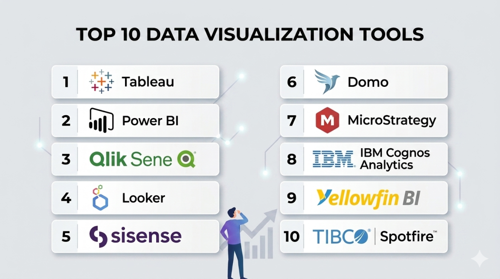
Top 10 Data Visualization Tools
#1 — Tableau
Short description: Tableau provides interactive dashboards and visual analytics for business users. It allows deep data exploration and insight discovery through drag-and-drop visualizations.
Key Features
- Interactive dashboards and storyboards
- AI-driven insights and predictive analytics
- Real-time data monitoring
- Extensive charting options
- Mobile accessibility
- Integration with cloud and on-premise databases
Pros
- Highly intuitive and visual interface
- Strong analytics for diverse datasets
Cons
- Steep learning curve for advanced analytics
- Enterprise licenses can be expensive
Platforms / Deployment
- Windows, macOS, Web
- Cloud / On-premise
Security & Compliance
- SSO, MFA, encryption
- SOC 2, GDPR
Integrations & Ecosystem
- Salesforce, Snowflake, Redshift
- REST API support
- Third-party connectors
Support & Community
- Comprehensive documentation and strong community
- Professional onboarding and support tiers
#2 — Power BI
Short description: Power BI enables self-service analytics with seamless Microsoft ecosystem integration. It offers dashboards, real-time reporting, and AI-assisted insights.
Key Features
- Customizable dashboards
- AI and machine learning integration
- Excel and Azure compatibility
- Mobile-ready reports
- Alerts and notifications
Pros
- Affordable and user-friendly
- Deep integration with Microsoft products
Cons
- Limited non-Microsoft integration options
- Advanced data modeling requires training
Platforms / Deployment
- Windows, Web, iOS, Android
- Cloud / On-premise
Security & Compliance
- RBAC, SSO, encryption
- SOC 2, ISO 27001, GDPR
Integrations & Ecosystem
- SQL Server, Azure, Excel
- REST APIs for external connections
- Marketplace extensions
Support & Community
- Microsoft support tiers and active forums
#3 — Qlik Sense
Short description: Qlik Sense provides associative data exploration and guided analytics for interactive insights. It enables both self-service analytics and governed reporting.
Key Features
- Associative data model
- AI-assisted analytics
- Drag-and-drop visualizations
- Guided dashboards
- Data storytelling
Pros
- Flexible data exploration
- Strong connectivity options
Cons
- Learning curve for new users
- Costly for smaller teams
Platforms / Deployment
- Web, Windows
- Cloud / On-premise
Security & Compliance
- RBAC, encryption
- SOC 2, GDPR
Integrations & Ecosystem
- Databases, SaaS apps, ETL tools
- API connectivity
Support & Community
- Active user community and documentation
#4 — Looker
Short description: Looker offers modern BI with embedded analytics and real-time dashboards. Its model-based approach simplifies data exploration and reporting for business users.
Key Features
- Embedded analytics
- LookML modeling
- Real-time dashboards
- Collaboration tools
- API access
Pros
- Cloud-native and scalable
- Flexible embedded analytics
Cons
- Requires LookML knowledge
- Limited offline functionality
Platforms / Deployment
- Web
- Cloud
Security & Compliance
- SSO, MFA, encryption
- SOC 2, GDPR
Integrations & Ecosystem
- BigQuery, Snowflake, Redshift
- API support for embedding dashboards
Support & Community
- Vendor support and community forums
#5 — Sisense
Short description: Sisense provides AI-driven analytics with in-chip data processing for fast dashboards and embedded BI solutions.
Key Features
- High-performance analytics
- AI-assisted insights
- Embedded dashboards
- Interactive visualizations
- Cloud and on-prem support
Pros
- Excellent performance at scale
- Embeddable for SaaS applications
Cons
- Technical expertise required
- Complex setup
Platforms / Deployment
- Web
- Cloud / On-premise
Security & Compliance
- SSO, RBAC, encryption
- SOC 2, GDPR
Integrations & Ecosystem
- ETL tools, databases, SaaS connectors
- API and SDK for embedding
Support & Community
- Documentation and enterprise support
#6 — Domo
Short description: Domo is a cloud-native visualization platform delivering interactive dashboards, mobile analytics, and collaborative reporting.
Key Features
- Cloud dashboards
- Real-time monitoring
- Mobile analytics
- Alerts and notifications
- Collaboration features
Pros
- Easy adoption and user-friendly
- Strong mobile analytics
Cons
- Pricing can be high
- Limited on-prem options
Platforms / Deployment
- Web, iOS, Android
- Cloud
Security & Compliance
- RBAC, encryption, SSO
- SOC 2, GDPR
Integrations & Ecosystem
- Salesforce, Redshift, Snowflake
- API and pre-built connectors
Support & Community
- Vendor support, training, and forums
#7 — MicroStrategy
Short description: MicroStrategy provides enterprise-grade BI with mobile dashboards, advanced analytics, and embedded capabilities.
Key Features
- Enterprise analytics
- Mobile and embedded dashboards
- Governance and security
- Data discovery
- Self-service reporting
Pros
- Highly secure and scalable
- Extensive analytics capabilities
Cons
- Steep learning curve
- Expensive for small teams
Platforms / Deployment
- Web, Windows, iOS, Android
- Cloud / On-premise
Security & Compliance
- SSO, RBAC, encryption
- SOC 2, ISO 27001, GDPR
Integrations & Ecosystem
- Databases, ETL tools, SaaS apps
- APIs for embedding analytics
Support & Community
- Professional services and enterprise support
#8 — IBM Cognos Analytics
Short description: IBM Cognos Analytics provides AI-powered reporting, dashboards, and data governance for enterprise users.
Key Features
- AI-assisted reporting
- Automated dashboards
- Data modeling
- Governance and compliance
- Interactive visualization
Pros
- Strong AI and automation
- Enterprise-grade governance
Cons
- Complex interface
- Less intuitive UI
Platforms / Deployment
- Web
- Cloud / On-premise
Security & Compliance
- SSO, RBAC, encryption
- SOC 2, ISO 27001, GDPR
Integrations & Ecosystem
- Databases, ETL, cloud apps
- API support
Support & Community
- Vendor support and training resources
#9 — Yellowfin BI
Short description: Yellowfin BI focuses on collaboration with dashboards, storyboards, and automated insights for business users.
Key Features
- Collaborative dashboards
- Storyboards and reports
- Automated insights
- Embedded analytics
- Mobile BI
Pros
- Intuitive and collaborative
- Easy for non-technical users
Cons
- Limited advanced analytics
- Fewer integrations
Platforms / Deployment
- Web, iOS, Android
- Cloud / On-premise
Security & Compliance
- SSO, RBAC, encryption
- SOC 2, GDPR
Integrations & Ecosystem
- Databases, SaaS apps, ETL connectors
- API access
Support & Community
- Vendor support and community forums
#10 — TIBCO Spotfire
Short description: Spotfire delivers data visualization, dashboards, and predictive analytics with interactive exploration and AI insights.
Key Features
- Interactive dashboards
- Predictive analytics
- Real-time monitoring
- Advanced visualizations
- Mobile access
Pros
- Strong visualization options
- Advanced analytics features
Cons
- Requires technical knowledge
- Premium pricing for full features
Platforms / Deployment
- Windows, Web
- Cloud / On-premise
Security & Compliance
- SSO, RBAC, encryption
- SOC 2, GDPR
Integrations & Ecosystem
- Databases, ETL, SaaS tools
- API and SDK support
Support & Community
- Documentation and enterprise support
Comparison Table (Top 10)
| Tool Name | Best For | Platform(s) Supported | Deployment | Standout Feature | Public Rating |
|---|---|---|---|---|---|
| Tableau | Interactive dashboards | Windows, macOS, Web | Cloud / On-premise | AI-powered visualization | N/A |
| Power BI | Microsoft ecosystem | Windows, Web, iOS, Android | Cloud / On-premise | Excel & Azure integration | N/A |
| Qlik Sense | Self-service analytics | Web, Windows | Cloud / On-premise | Associative data model | N/A |
| Looker | Embedded analytics | Web | Cloud | Model-based reporting | N/A |
| Sisense | Embedded & AI analytics | Web | Cloud / On-premise | High-performance in-chip processing | N/A |
| Domo | Cloud-native BI | Web, iOS, Android | Cloud | Mobile dashboards | N/A |
| MicroStrategy | Enterprise analytics | Web, Windows, iOS, Android | Cloud / On-premise | Governance & security | N/A |
| IBM Cognos Analytics | AI-driven reporting | Web | Cloud / On-premise | Automated insights | N/A |
| Yellowfin BI | Collaborative dashboards | Web, iOS, Android | Cloud / On-premise | Storyboards & collaboration | N/A |
| TIBCO Spotfire | Data visualization & analytics | Windows, Web | Cloud / On-premise | Predictive analytics | N/A |
Evaluation & Scoring of Data Visualization Tools
| Tool Name | Core (25%) | Ease (15%) | Integrations (15%) | Security (10%) | Performance (10%) | Support (10%) | Value (15%) | Weighted Total (0–10) |
|---|---|---|---|---|---|---|---|---|
| Tableau | 9 | 8 | 9 | 8 | 9 | 8 | 7.5 | 8.3 |
| Power BI | 8.5 | 9 | 8 | 8 | 8 | 7.5 | 8 | 8.2 |
| Qlik Sense | 8 | 7.5 | 8 | 8 | 8 | 7.5 | 7.5 | 7.8 |
| Looker | 8 | 7 | 7.5 | 8 | 7.5 | 7 | 7.5 | 7.5 |
| Sisense | 8 | 7 | 7.5 | 7.5 | 7.5 | 7 | 7.5 | 7.55 |
| Domo | 7.5 | 8 | 7 | 7.5 | 7 | 7 | 7.5 | 7.45 |
| MicroStrategy | 9 | 7 | 8 | 8.5 | 8.5 | 8 | 7 | 8.25 |
| IBM Cognos Analytics | 8 | 7 | 7.5 | 8 | 7.5 | 7 | 7 | 7.45 |
| Yellowfin BI | 7.5 | 8 | 7 | 7.5 | 7 | 7 | 7 | 7.3 |
| TIBCO Spotfire | 8 | 7 | 7 | 7.5 | 7.5 | 7 | 7 | 7.35 |
Which Data Visualization Tools Tool Is Right for You?
Solo / Freelancer
Power BI and Yellowfin BI provide affordable, easy-to-use solutions for individual analysts or small teams.
SMB
Domo and Sisense are ideal for mid-market teams needing cloud-based, collaborative dashboards.
Mid-Market
Looker and Qlik Sense offer advanced analytics and integration for growing organizations.
Enterprise
Tableau, MicroStrategy, IBM Cognos, and TIBCO Spotfire provide enterprise-grade, secure, and scalable visualization capabilities.
Budget vs Premium
Budget-conscious teams can consider Power BI or Yellowfin; premium users can opt for Tableau, MicroStrategy, or Cognos for advanced features.
Feature Depth vs Ease of Use
Tableau and MicroStrategy excel in depth, while Domo and Power BI prioritize usability.
Integrations & Scalability
Organizations should ensure their visualization tool supports a wide range of data sources, ETL pipelines, and cloud data warehouses.
Security & Compliance Needs
Select tools with SOC 2, ISO 27001, GDPR compliance, RBAC, and encryption for regulated industries.
Frequently Asked Questions (FAQs)
1. What are Data Visualization Tools?
Software that converts raw data into visual insights through charts, dashboards, and reports for better decision-making.
2. Can small teams use these tools effectively?
Yes, tools like Power BI and Yellowfin are designed for smaller teams and provide cost-effective solutions.
3. Are these tools suitable for real-time analytics?
Many platforms support real-time dashboards, alerts, and streaming data visualization.
4. Do these tools offer predictive analytics?
Some tools integrate AI/ML for forecasting and anomaly detection, like Tableau and Sisense.
5. How steep is the learning curve?
Tools like Power BI and Domo are beginner-friendly; Tableau, MicroStrategy, and Cognos require more training.
6. Can these tools be accessed on mobile?
Yes, most platforms provide mobile dashboards for remote access.
7. Are these tools secure?
Yes, they include RBAC, SSO, encryption, and compliance with SOC 2, GDPR, and ISO 27001.
8. Can they integrate with other BI or data tools?
Most provide connectors for databases, cloud warehouses, ETL pipelines, and SaaS apps.
9. How do I choose between embedded and self-service BI?
Consider team size, technical expertise, and the need for governance or embedding analytics.
10. What common mistakes occur during deployment?
Ignoring data quality, poor user training, inadequate governance, and underestimating integration complexity.
Conclusion
Data Visualization tools are essential for converting complex data into actionable insights. Platforms like Tableau, Power BI, and Qlik Sense provide robust analytics and interactive dashboards, while Domo, Looker, and Sisense offer cloud-native and embedded solutions. Selecting the right tool requires evaluating team size, data complexity, integration needs, security requirements, and usability. Conducting pilots and trials ensures the chosen platform aligns with organizational goals and empowers teams to make data-driven decisions effectively.
Find Trusted Cardiac Hospitals
Compare heart hospitals by city and services — all in one place.
Explore Hospitals